Components Checkboxes/Toggles

Checkboxes/Toggles

Toggles and Checkboxes allow the user to select options. There are Three kinds: On/Off Toggle, Radio Toggle, and Multi Checkbox. Selection controls use the theme’s accent color.

On/Off Toggles

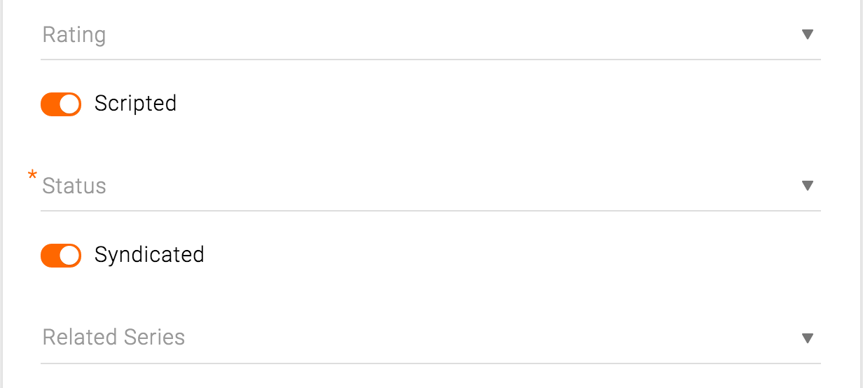
On/off switches toggle the state of a single settings option. The option that the switch controls, as well as the state it’s in, should be made clear from the corresponding inline label. The label should be positively worded so that the “on” state matches the “affirmative”.

Use cases: on/off toggle for Syndicated and Scripted

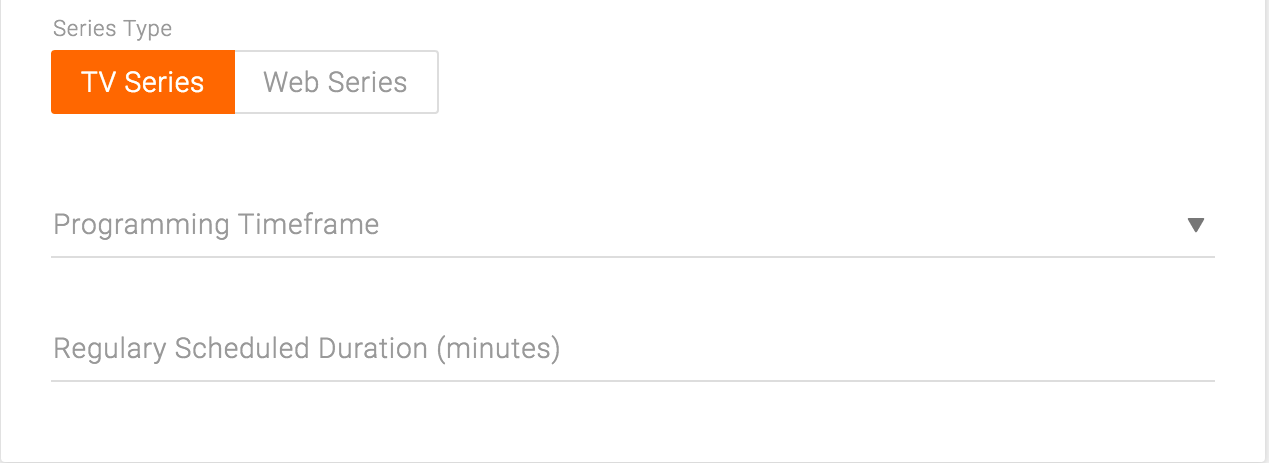
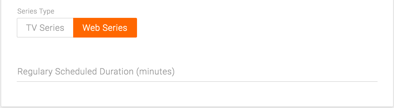
General info card on Series page

Radio Toggles

Radio toggle allows the user to choose one of the grouped options. Use a radio toggle when there are two or more options that logically belong to a single group. It only allows exclusive selection; only one of the items can be selected at a time.

A radio toggle can be simply used to select one option, as well as to toggle among the different views of a part of a form. The different views would only present the applicable fields depending on the selection of the radio toggle.

A radio toggle should present visually clear distinction among selected, hover, and unselected. This may be achieved by the appropriate layout, spacing, and the use of color. Individual buttons should be labeled with text, an icon, or both.

Use cases: TV or Web episode selector

Toggle on TV episode

Toggle on Web episode

Multi-Checkboxes

Multi checkbox is only used for images. The list item is an image, and the checkbox appears on rollover when none of the items are selected. Once one or more items are selected, all the checkboxes on other items appear to indicate that those items are in the same group as the selected ones and thus can also be selected.

Use cases: Asset Library, Media card

Multiple items selected on Asset Library page