//= ../template/css.html Patterns - Navigations - Concerto Style Guide | DPIM UX Team
Patterns Navigations
//= ../template/menu.html

Navigations

Navigation guides users between different parts of the CMS. Concerto’s navigation focuses attention on all key destinations by placing them in side navigation.

Usage

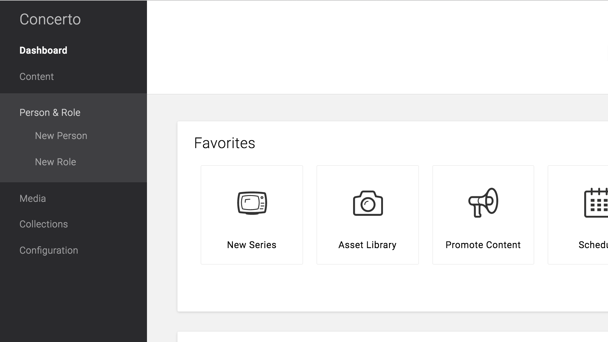
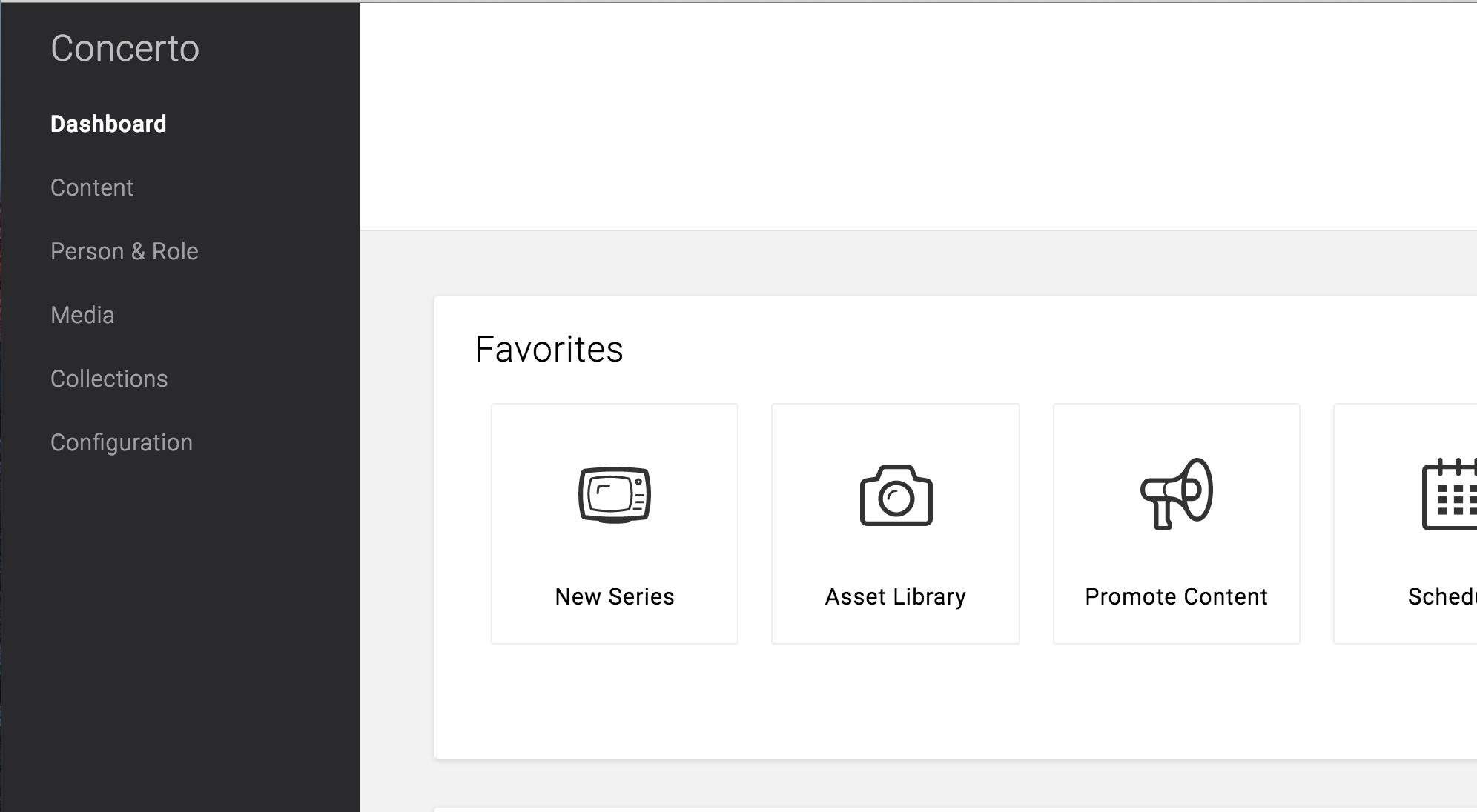
Navigation through Concerto is intuitive and predictable. Both new and returning users should be able to figure out how to move through the CMS with ease.

Concerto's side navigation can be permenantly pinned to the side or in a drawer that toggles open or closed.

Nested Navigation

When you have multiple levels of navigation, sibling views should be nested underneath their parent.

Nested navigation under Person & Role

Navigation Drawer

In order to account for a nested navigation system, Concerto uses a side navigation. Side navigation can display many navigation targets at once. A drawer remains hidden until invoked by the user. By clicking the hamburger menu icon, users can see it.

Desktop example of a navigation drawer on the Concerto Dashboard

Expanding Navigation Drawer

If you have a deep navigational hierarchy, you may expand that hierarchy within the navigation drawer. Upon selecting a level, the level of navigation below is revealed. Selecting a collapsed section expands that level in-line, hiding all levels outside of it.

Desktop example of an expanding left navigation

Permenant Navigation

Recommended default for desktop

Permanent navigation drawers are always visible and pinned to the left edge, at the same elevation as the content or background. They cannot be closed.

Pinned Navigation on Dashboard

Temporary Navigation

Recommended for tablet

Required for mobile

Temporary navigation drawers can toggle open or closed. Closed by default, the drawer opens temporarily above all other content until a section is selected.

Tablet example of a navigation drawer

//= ../template/js.html