//= ../template/css.html Patterns - Empty States - Concerto Style Guide | DPIM UX Team
Patterns Empty States
//= ../template/menu.html

Empty States

Empty states occur when the regular content of a view can’t be shown. It might be a list which has no items, or a search which returned no results. Although these states aren’t typical, they are important opportunities for good design to avoid user disappointment or confusion.

Actionable Empty States

An actionable empty state displays an interactive icon and a text tagline.

Use actionable empty state when:

  • Only one action is needed to fill the content
  • The action involves showing pop-up, overlay, or new tab/window

Do NOT use actionable empty state when:

  • There are multiple possible actions that can be performed to fill the content
  • The original action requires interaction with other than buttons (e.g. search bar)
  • The action redirects the user to the different section in the same page

Use an Icon that Conveys the purpose of the action

  • Allow users to identify the information without adding extra cognitive load
  • Communicate possible functions in a single shape
  • Help users to navigate fast and directly

Include a tagline that:

  • Has a positive tone
  • Is consistent with the CMS brand
  • Directly conveys the purpose of the action using active verb and imperative sentence.

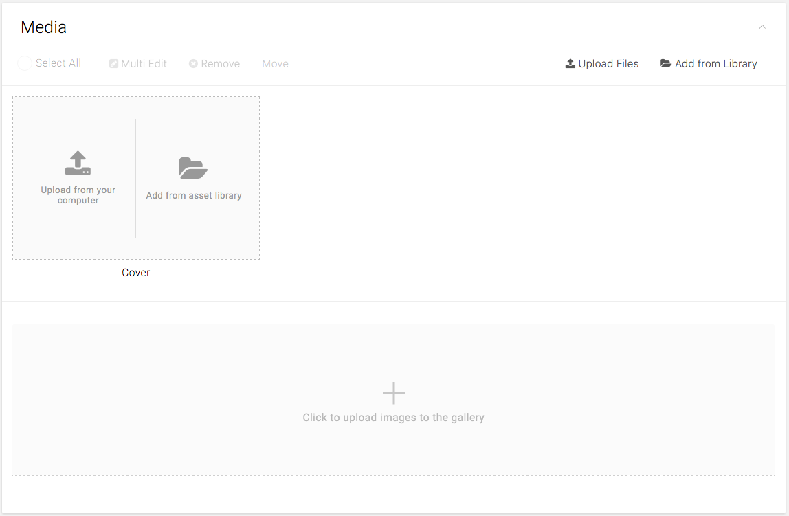
Media Card on Gallery page

Avoid Completely Empty States

The most basic empty state displays a non-interactive icon and a text tagline.

Make the users get excited about the content and learn by using the app by themselves. Consider providing starter content that will allow users to explore the application right away.

Recommendations:

  • Use content that has broad appeal and usage and demonstrates primary features.
  • Give users the ability to delete and replace this content with clear guidelines how to do so.
  • If possible, provide content that’s personalized for the user.

Dashboard page

//= ../template/js.html