//= ../template/css.html Components - Cards - Concerto Style Guide | DPIM UX Team
Components Cards
//= ../template/menu.html

Cards

A card is a sheet of material that groups several types of content about a single subject. It could contain a photo, text, input fields, links, and many others.

Usage

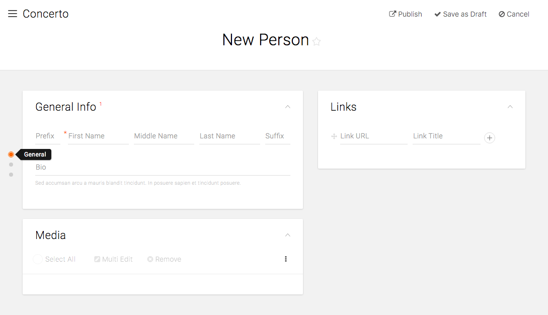
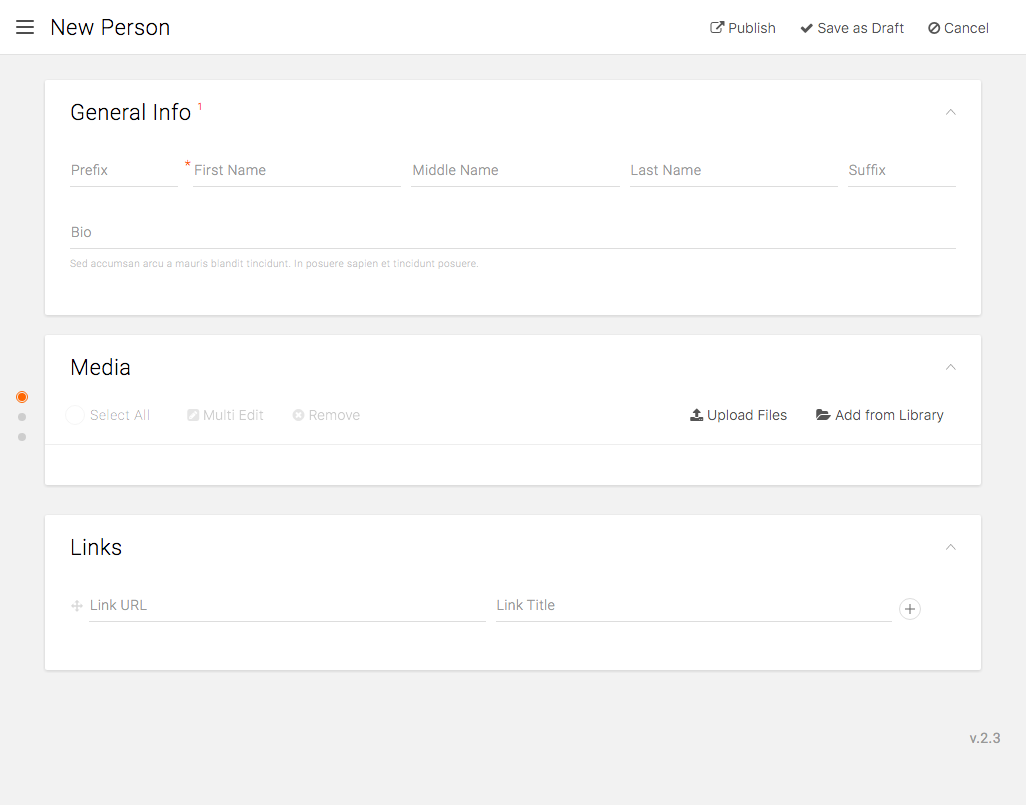
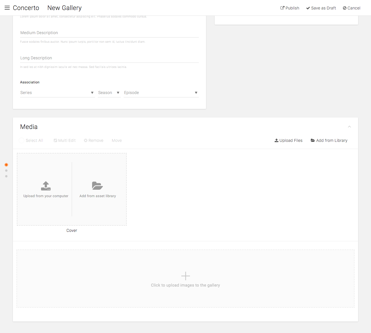
A card conveniently displays elements that are different in type and sizes in one group. A card collection is a group of cards laid on the same plane.

When to Use

Use cards for the following cases:

  • Comprised of multiple data types per card, but coherent in the information each card is conveying.
  • Does not require direct comparison among cards.
  • Content varies in length, e.g. title, description.
  • Content is interactive with multiple actions, e.g. Edit, select, remove on image cards.

Use case:

  • Card layout with multiple fields on one card.
  • Asset library’s image card.

Components

As cards are a major component for the CMS, there are multiple types of cards used each with distinct functions.

A card has the following components:

  • Title: Title of the card. It should represent the purpose of the grouping and the fields inside it.
  • Required fields count: When there is one or more required fields, a number count is displayed next to the title indicating how many required fields are yet to be filled out. As user completes the required field, the number counts down and disappears when it reaches to 0.
  • Folding icon: On the top-right corner, there is a caret that toggles to open or fold the card. The card is opened when pointing up, and it is closed when pointing down. By folding cards, user can easily navigate the page that can potentially get long.
  • Section subtitles: When fields within a card form further subgroups, there may be a subtitle that helps user to understand the purpose of the corresponding fields.

Series General Info Card

Card Layout

Side Navigation

The side navigation helps users to navigate through a page that contains multiple cards. It has following components:

  • Circle: Each circle represents a card in the page. The order of the circles represents the order of the cards, which would be reflected in the mobile layout as well. All the cards on the left column precedes the cards on the right, in order.Upon clicking on a circle, the screen scrolls to the top of the corresponding card. If the screen is already at the top of the card (e.g. the topmost card on the initial screen), then there is no scrolling. If the corresponding card is the very bottom card and the height does not exceed the height of the current screen, then the very bottom of the card is aligned with the very bottom of the screen. It DOES NOT scroll to the top of the card and leave the empty space at the bottom.Also, the corresponding card’s outline pulses in orange twice to indicate which card is selected.
  • Rollover labels: On mouseover, the title of the card is displayed in the tooltip.
  • Required field indicator: When there is one or more empty required fields, the circle is marked with orange circle and outline.

New Person Content Type

Responsive Ordering

As discussed above, all the cards on the left column precedes the cards on the right when collapsed into one column.

Reduced screen width

Spanning Cards

By default, all cards are laid in either the left or the right column. However, a card can span both columns when the said card has the most prominent use in the content.

Media Card in create Gallery section

//= ../template/js.html