The most used component, text fields allow users to input the necessary information to create and edit content. Text fields allow the user to input text, select text, and lookup data via auto-completion.
Text Fields
Behavior
All Text Fields
When the user engages with the text input field, the floating inline labels move to float above the field, and takes on the theme’s accent color
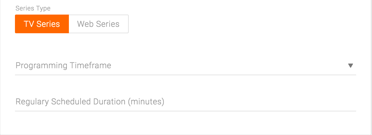
Toggle on TV episode
Single-Line Text Fields
Single-line fields automatically scroll their content to the left as the text input cursor reaches the right edge of the input field. Single line text fields have character limits.
Required Fields
Multi checkbox is only used for images. The list item is an image, and the checkbox appears on rollover when none of the items are selected. Once one or more items are selected, all the checkboxes on other items appear to indicate that those items are in the same group as the selected ones and thus can also be selected.
Use cases: Asset Library, Media card
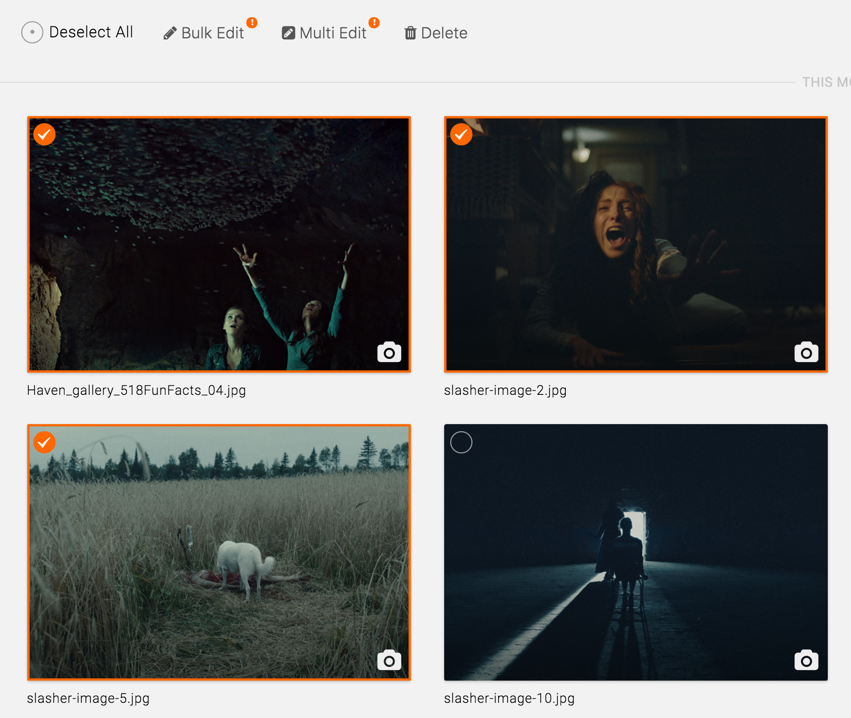
Multiple items selected on Asset Library page
Helper Text
Multi checkbox is only used for images. The list item is an image, and the checkbox appears on rollover when none of the items are selected. Once one or more items are selected, all the checkboxes on other items appear to indicate that those items are in the same group as the selected ones and thus can also be selected.
Use cases: Asset Library, Media card
Multiple items selected on Asset Library page